Visualize Learning
- Chrissy Gonzalez

- Aug 27, 2025
- 2 min read

I don’t really think of myself as a science person, but I did graduate from a STEM-focused high school. Students had to choose between two curriculum tracks – biology or physics – and although I was terrible at physics, I was weirdly good at biology. My favorite class was microbiology, mainly because the teacher was so good at describing microorganisms vividly. The secret to my success? I loved drawing. I put all of my energy for sketching into drawing elaborate flashcards of biological processes, and that ensured a deep understanding of the material and excellent grades on the exams. I can still picture my colored pencil diagrams years later and remember the details of how photosynthesis or meiosis worked. And it was effortless because I only needed to recall one image.
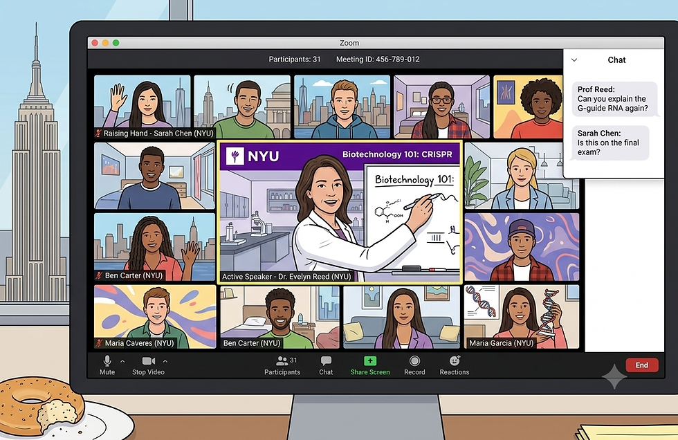
Since starting graduate school for Computer Science, I’ve found it much harder to fit a key idea into a single drawing or diagram. There are usually multiple steps or outcomes within a concept, and sometimes, the ideas are too abstract to represent memorably. Plus, If I am able to visualize what I need to learn, I usually don’t have the time to do it. Luckily, there’s a wealth of free educational resources online, so much so that the biggest challenge is just identifying which ones are the most accurate and interesting. Some of my professors (like Professor Ratan Dey and Professor Daniel Katz-Braunschweig, who taught in the Tandon Bridge program) provided links to augment their classes, but the majority of instructors don’t. I’m happy to search on my own, but I would much prefer to watch a video sanctioned by my instructor. Still, even a resource that’s partially related to class content can provide some insight. If you need some inspiration, please enjoy some resources that I’ve personally found helpful:
Algorithm visualizations This is an interactive site that visualizes a large number of algorithms and data structures. It must have taken a massive amount of work to create, and it’s available for free! It’s an amazing resource.

TCP Sliding Window Although this video is six years old, and it shows a recording of an website that isn’t online anymore, the information is still accurate. This part comes at the very end, so it’s worth scrubbing through a video’s timeline to see what it includes.

Bayes Theorem This channel has the most beautiful math visualizations I’ve ever seen. If this had been around when I was in high school, maybe I would be a physicist today?

Logical Address to Physical Address Translation The first time I watched this video (provided by a professor) I was distracted by its low production quality, but it turned out to be extremely valuable. I would have missed it if I was searching on my own because I didn’t know what to look for, and because it’s not flashy.

Visualizing your coursework doesn’t have to be a lot of work if you can find something existing online. Everyone is a visual learner sometimes, and some ideas make more sense once you see them in action. Share what you find with your classmates, and you might find they have a good collection, too!


Comments